Project cover photo

Brand strategy
Visual identity
Iconography
Motion design

SportBench

Sportbench is a new social network for amateur athletes who want to up their game through competition and maybe make some new friends along the way.

Sportbench offers tools that enable athletes to find partners on their level, anytime and anywhere. For its launch, the platform offers leagues and local events in ping pong, mainly in Berlin and other German cities.

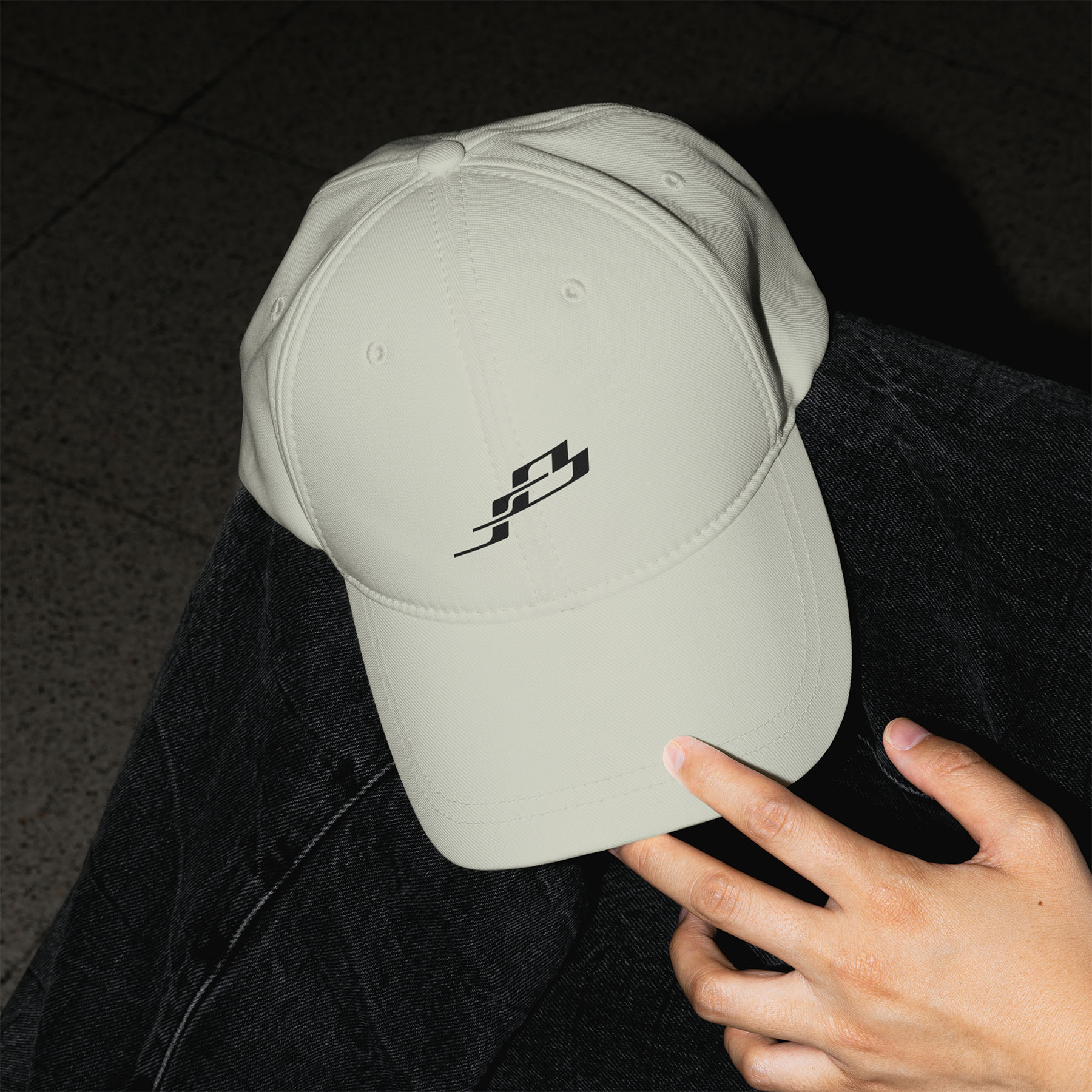
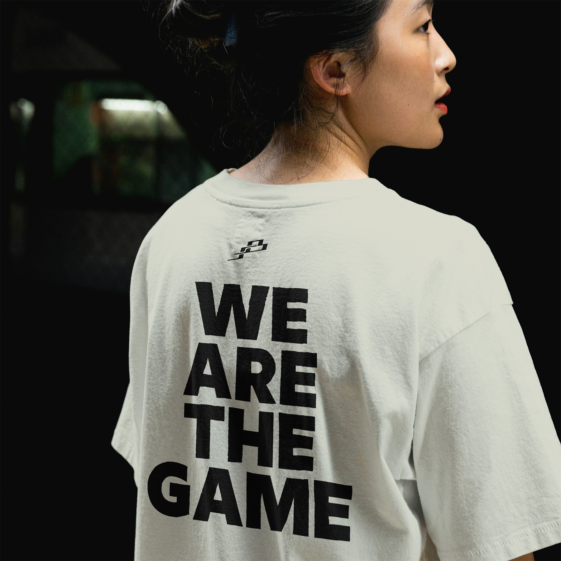
I have had the pleasure to work on a Brand Strategy + Identity package for SportBench, as well as an iconography system, marketing material and merchendise items.

In the brand strategy phase, we wanted to aim for a brand's tone of voice that is daring, confident, and vibrant.

With the term "Athletic Tribe" as our brand DNA, we wanted a simple tagline that resembles this community feeling and togetherness in a bold, slightly arrogant way.
This was the birth of "We're The Game".
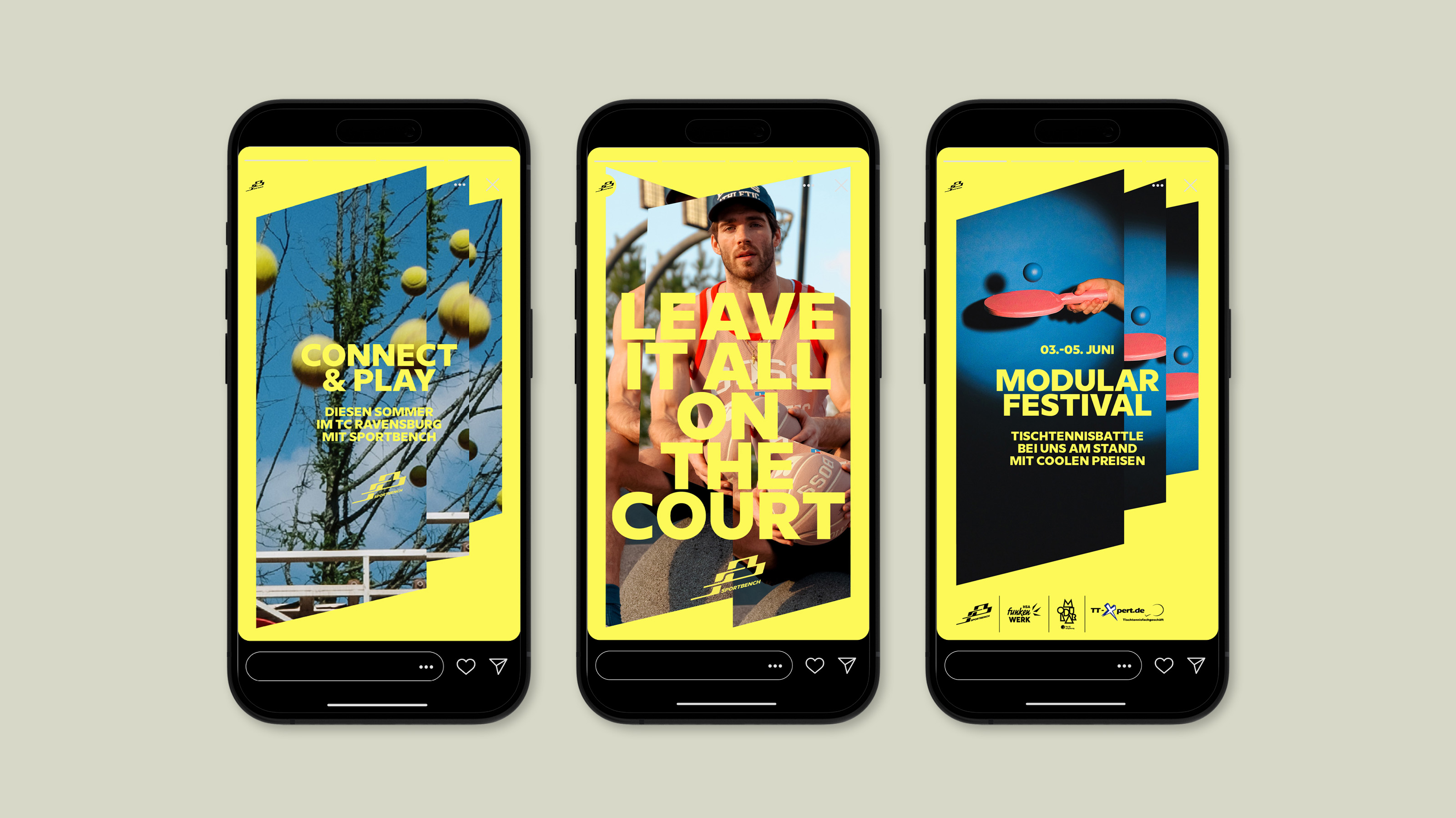
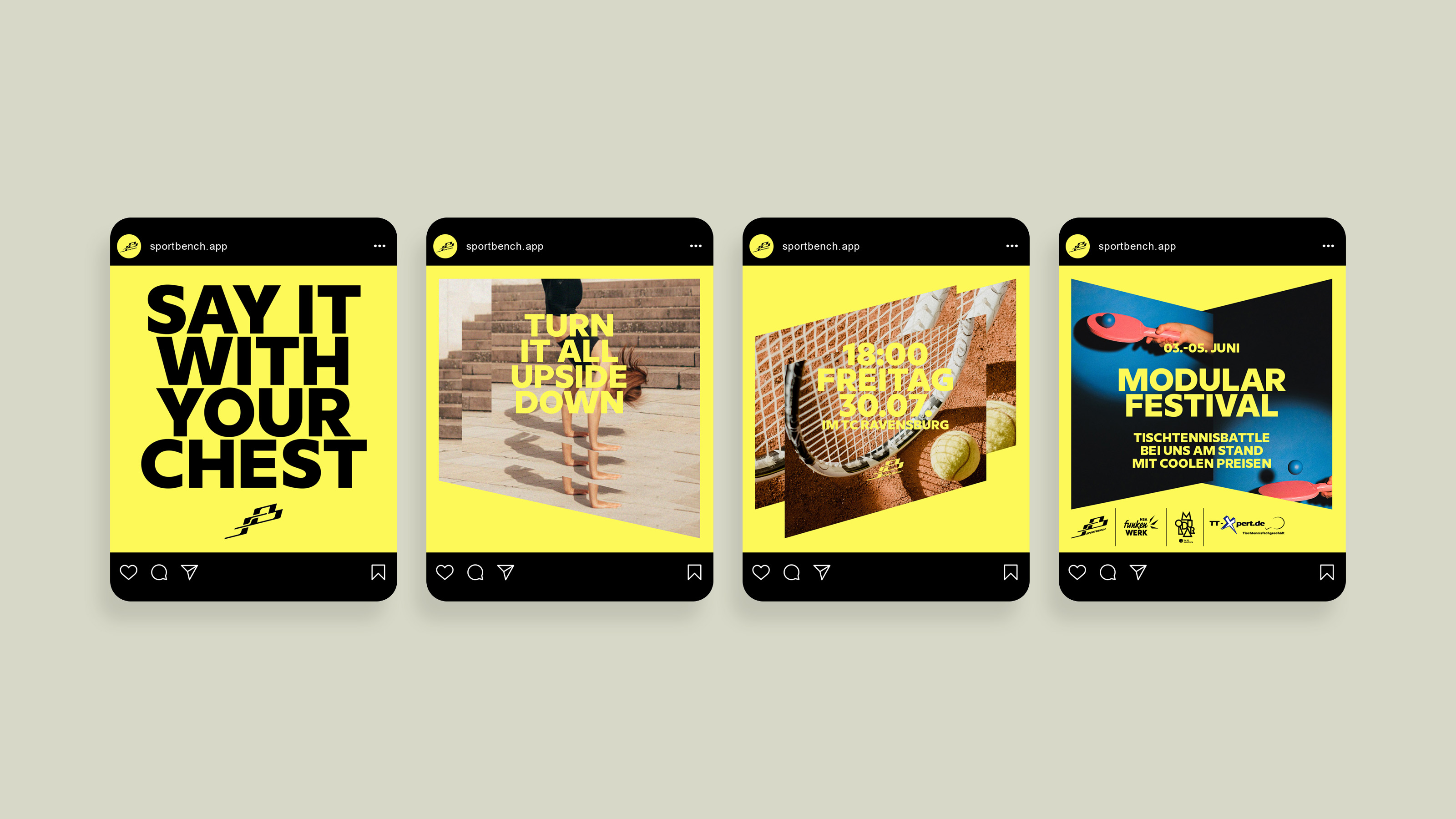
The SportBench identity is a loud and vibrant one. Large proportions of our design spaces use our luminating yellow tone. Our typography choice went for the clean, edgy, and dominant Milliard by Rene Bieder. Of course we picked the ExtraBold weight, which means our texts are not there only to be read, they are also a considerable colour space that glues the composition together.

To convey the dynamism we aim for as a sports brand, our layouts feature offset duplicates of one or more photos or videos. The resulting sharp shapes and repetition give a feeling of movement that is an integral part of our identity.
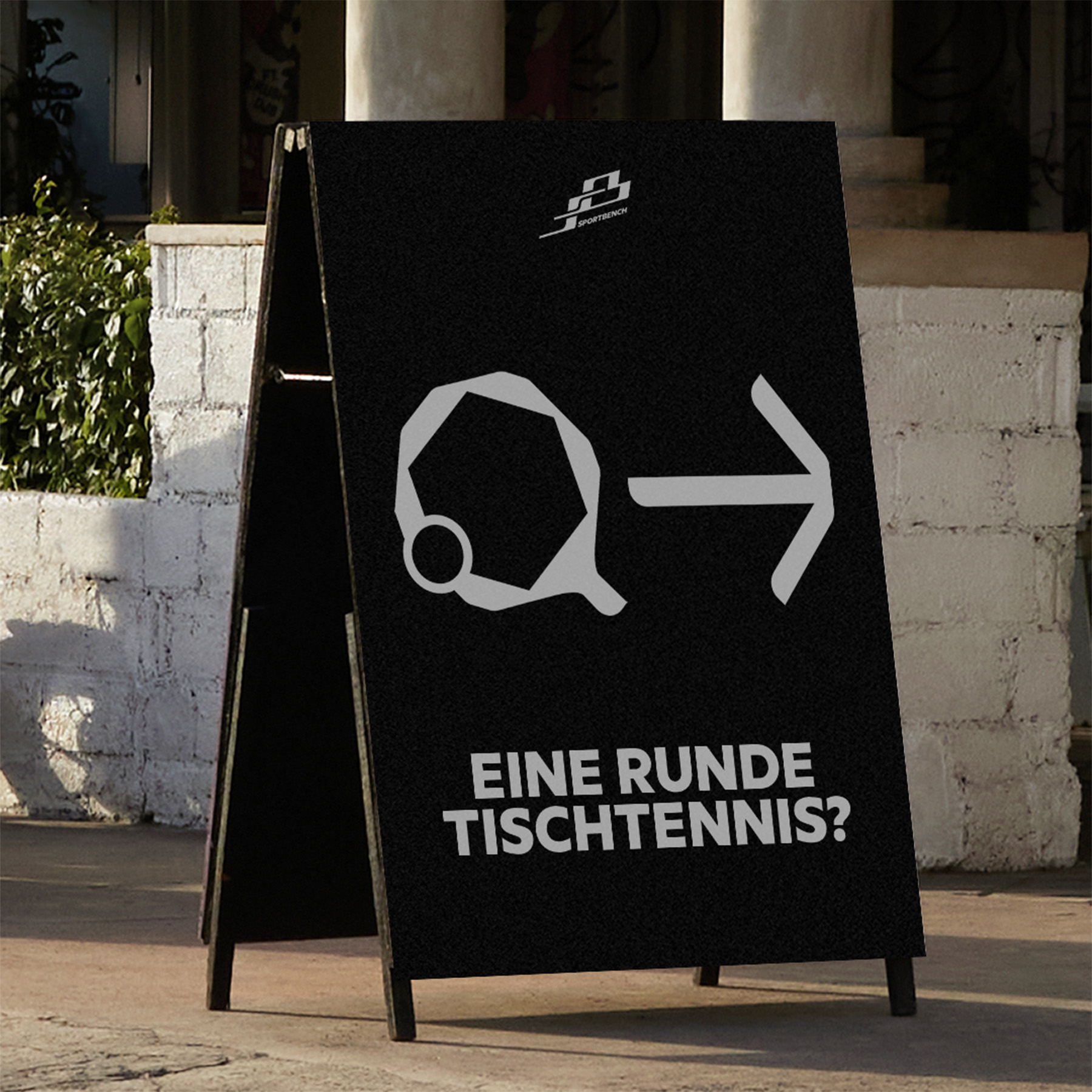
The iconography system uses a similar form language to that of the logo. The rounded double-corners give a strong and dynamic character, which almost elevates the icons towards pictograms that we can use as decorative elements to create graphics or tell short stories using combinations of two or three icons.

Get in touch

poster
visit
case